
The purpose of including images on your website and blog are to make it look nice, right? Well, yes… but that’s not all they can do! With just a little bit of prep work, your website and blog images can also help you with SEO. Here’s how to optimize your images so they can do more than just look pretty. Optimize them for SEO!
(In a hurry? Scroll down to the bottom for a quick checklist of all the items I recommend in this article!)
1. Save your Images in an Appropriate Size
Your images can have a significant impact on how long it takes your website to load. One of the most common culprits of a slow-loading web page are images that are too large for online viewing. I have seen blogs that take 10 seconds or more to load. (Buh bye. You just lost me as a reader. I don’t have time for that!)
When I take a closer look at the cause, most often it’s because they have images that are w-a-a-a-y too big and are just taking too long to download. You might not notice a big difference in the load time on your speedy internet connection at home. But what about all your mobile viewers who are using their cellular connection? Keep them in mind too – or you might lose them before you’ve even had a chance for them to read and fall in love with your blog!
Not only are you turning off readers with your slow pages; but you could be turning off Google too! Google takes into account how quickly your website loads – so you definitely want to keep that in mind with your SEO efforts.
So what’s an “appropriate” size for website and blog images? Here are my tips for getting that file size down so it’s not so… well, inappropriate!
- Save your image in a width and height that fits in your website. Even if you upload a large image but set it to display really small on your website, the large image will still have to be loaded. The content area on most websites is 1,200 pixels wide or smaller. So it doesn’t make sense to upload an image from your camera that’s 4,000 pixels wide. Here’s another example: My blog posts include a sidebar on the right side, leaving a width of about 800 pixels for my blog post content. So when I create images for my blog posts, I save them as 800 pixels wide or smaller.
- Find a good balance between file size and quality. One way to do this is to save your image in a file type that helps reduce the file size. For example, if your image is a photo, you most likely will want to save it as a JPG image. Using your graphics program you can then play around with the quality level until you’re comfortable with the file size but the photo still looks good. If you have a screenshot or an icon or logo, you most likely will want to save it as a PNG file.
- Pay attention to the file size. I usually recommend trying to get the file size down to under 100KB, if possible. (Exceptions are when you need a high-quality photo, such as for a photographer’s portfolio – or if you need a very large photo for a full-width slider or background image. But in those cases, try not to add a lot of additional images on that page that could slow down the page load time considerably.) Many photos from digital cameras and phones can be 5 MB or more! That’s over 5,000 KB – which is 50 times larger than what I recommend!
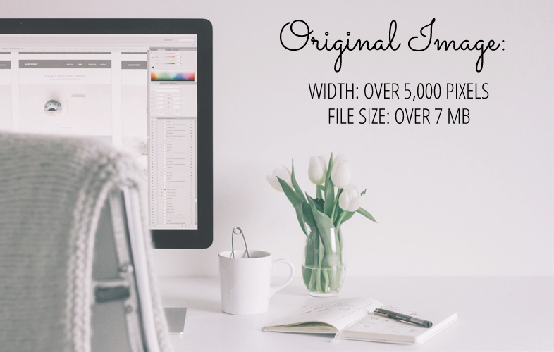
Let’s look at some examples. Here’s an original image that’s way too big for a website or blog. Its width is over 5,000 pixels and its file size is over 7MB.
First let’s change its image size (width/height) to fit an 800-pixel-wide content area.
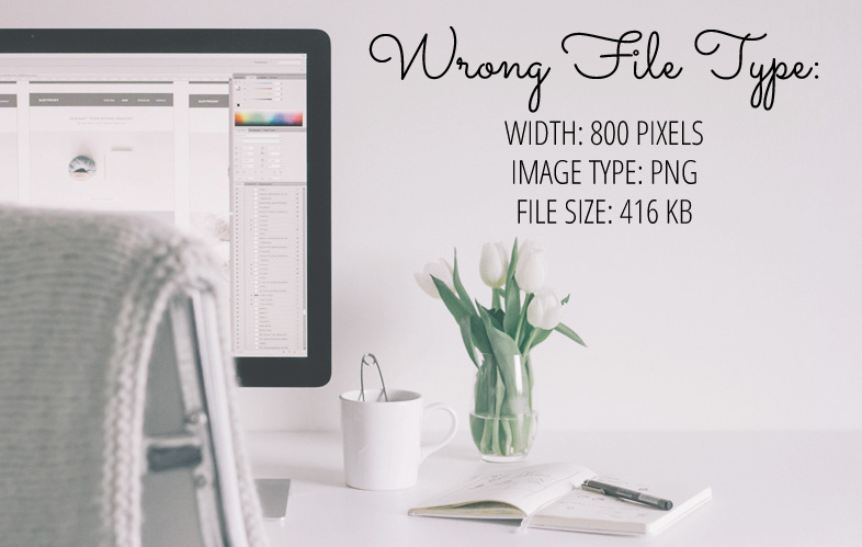
Next let’s choose the image type (JPG or PNG). Remember when I said that photos should usually be saved as a JPG instead of a PNG? Let’s just see what the file size would be if we saved this as a PNG image. Its file size is still way too big (over 400 KB).
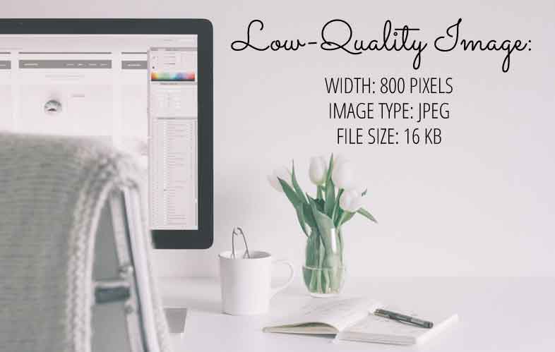
Next let’s try saving it as a low-quality JPG image. We have an awesome file size (16KB) — but it looks horrible!
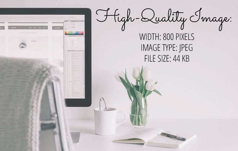
Let’s increase the quality and try to find a nice balance between a small file size and a good-looking image. This one is a keeper!
2. Give your Image an Informative File Name
Include your keywords (the topic of the image ) in your image’s file name. For example, a typical file name of a photo from a digital camera or phone might be: DSC14774.jpg. Do not keep this file name; instead, use your keywords separated by hyphens. For example: “dark-chocolate-espresso-cupcake-recipe.jpg”.
3. Include Alt Text and Title Information for your Image
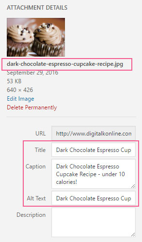
Use your keywords in the Alt text and title of the image. The “Alt” text of your image tells search engines what the subject of the image is. By default, WordPress will not include Alt text for your image and it will set the title as the image file name. Instead you should change the Alt text to be a brief description (for example: “Dark Chocolate Espresso Cupcake Recipe under 100 calories”). You could use the same text for the title – or even something a little bit shorter, like “Dark Chocolate Espresso Cupcake Recipe”.
Make sure you are using keywords that are relevant and useful. Don’t participate in “keyword stuffing” or you can get penalized by search engines. An example of keyword stuffing would be an Alt text or title of:
“dark chocolate healthy espresso cupcake frosting cake recipe low-calorie dessert”. <– Don’t do that!
4. Pair your Image with Relevant Content
Choose images that are related to the topic of your web page or blog post. If your blog post is about a cupcake recipe, don’t include images of your cat. It’s not relevant (unless the cat is eating the cupcake)!
Your image should be related not only to the overall topic of your page (or blog post); but should also be placed near text that’s specifically related to the image. For example, above I have an image demonstrating the Alt text and title. That image is located near the paragraph where I discuss… you guessed it… the image alt text and title!
In addition, Google also recommends providing good, descriptive captions for your images when they’re relevant to the content. (Don’t do this for decorative images that aren’t related to your content though.)
Checklist for Optimizing Images for SEO
Here’s a quick checklist of all the items I mentioned above:
- Save your image in a width and height that fits in your website.
- Save your image in a file type that helps reduce the file size (usually JPG for photos and PNG for graphics).
- Find a good balance between file size and quality. (Try to save the image in a file size under 100 KB.)
- Includes your keywords (the topic of the image ) in your image’s file name.
- Use your keywords in the Alt text and Title of the image.
- Choose images that are related to the topic of your web page or blog post.
- Place your image near text that’s specifically related to the image.
- When appropriate, include descriptive captions for your images.
Don’t forget it… Pin it! 

Good stuff, Kelly. Basic, but even me, an old timer, needs reminders sometimes. So easy to slip into carelessness and laziness.
Will
Thanks, Will!
Great refresher! Thank you.
This is a great explanation. Love the use of images and size/format descriptions. And yes, a great refresher, I’m not always great at updating all the alt text captions. Will definitely share 🙂
Thanks, Yari! I really appreciate that! 🙂
Thank you for the help! Great tips and something I definitely need to start doing.
You’re very welcome, Crystal!
Hello, the problem is that the photo with less than 800px gets low quality and too small in bigger monitors and in retina monitors, like monitors (for example, iMac) and TVs Full HD and SUHD.
If you are worried about the image quality in Retina monitors, you can create larger images. However, keep in mind that the larger the file size of the images, the slower it takes for your website to load.
Great tips. Quick question. How do you find the width of your website in order to size your photos correctly? You said most websites are 1,200 pixels wide or smaller. I have two sidebars so would that cut my width down to 400 pixels? Thanks for all your great information.
Thoughts in Progress
and MC Book Tours
Hi Mason,
You can take a screenshot of your website and measure the area in a graphics program. Or you can use Google Chrome’s Inspect tool or Firefox’s Firebug tool to find the widths of those areas too.
I just looked at your websites for you and here are the measurements:
The width of your Thoughts in Progress content area (minus the 2 sidebars) is 520 pixels. And the width of your MC Book Tours content area (minus the right sidebar) is 619 pixels.
Kelly, thanks so much for taking a look at both sites. I’ll definitely keep this in mind from now on when I size my photos. That’s a great help!
thank you so much – these instructions were so helpful, minimizing my frustration with wordpress
Relevant info …thankew kelly.
I’ve always struggled with the balance between image size and quality. Thank you for your helpful information not just in the post, but in answers to the comments as well. I’m definitely pinning and will see you on Twitter!