Author Website Design and Branding Project
Nancy Swisher
Project Summary
Nancy Swisher is a Transformational Coach, Spiritual Mentor and Artist. When she first contacted me about a website redesign, she was two months away from the launch of her new book, The Life That Woke Me Up Was My Own: A Memoir.
This project included designing a new logo and branding, creating a new website, and designing graphics for her social media accounts.
Services:
- Logo Design
- Branding
- Web Design and Website Build
- Website Care Plan
Deliverables:
- Logo
- Website Favicon
- Website Style Guide
- Stock Photos
- Website Graphics
- Mobile-Responsive WordPress Website with 10 Pages and a Blog
- Social Media Graphics
Other:
- Divi Page Builder
- On-Page SEO
- Web Hosting
- Website Maintenance
Results:
✨ After her new website launched, Nancy saw a 31% increase in program sales and an 11% increase in opt-ins! ✨
Original Website:
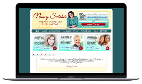
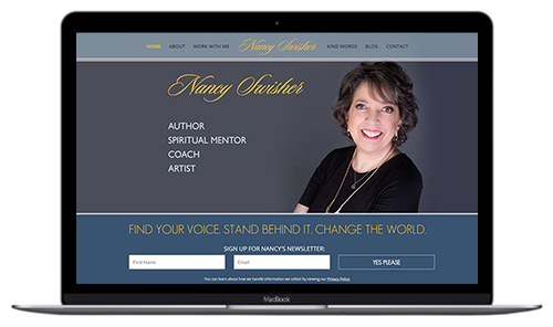
New Website:
Logo Design + Branding
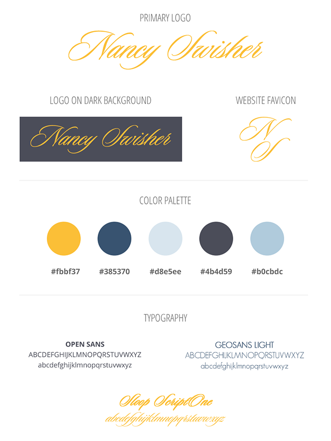
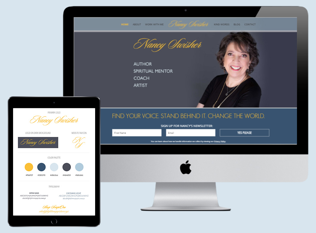
We started this project out with designing a new logo and branding. Nancy wasn’t sure of the colors she wanted; but she knew she wanted her branding to look more elegant and professional. Here is the final logo design and branding I created:
Website Redesign
When I first start working with a client, we have a conversation about the goals for the website. I don’t want a website to just look good… I also want it to help my clients with their business. Here are the goals we discussed for the new website.
Goals:
- An updated, professional design that is responsive on mobile devices
- Focus on her new book
- Provide more clarity on her programs
- Include multiple calls to action and opt-in offers
- Create social media graphics (that match her new branding) to promote her new book
Design:
Nancy knews she wanted an updated, professional web design; but she didn’t have specific ideas in mind… so I was starting with a blank slate. As a designer – this is so much fun! Here’s a look at the mood board of the new website:
Website:
I started the design process by recommending some designs and layouts that I thought would work well with both her personality and the goals she had for her website. I also made sure the design was responsive – so it looks great on all devices. Nancy has great taste, so of course she picked the design/layout that was also my top pick. 😉
Before I show you the full website, let’s revisit those goals so you can see how the final website all comes together.
Goal: Focus on her New Book
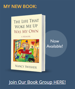
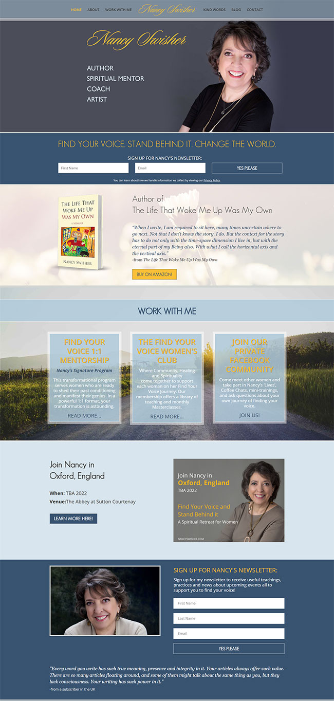
I designed a section on her home page that features her new book. It includes a quote from the book plus a button to purchase the book online.
We also have multiple references to her book throughout her website, including on her About page, on her Programs page and in the sidebar of her blog:
Goal: More Clarity on her Programs
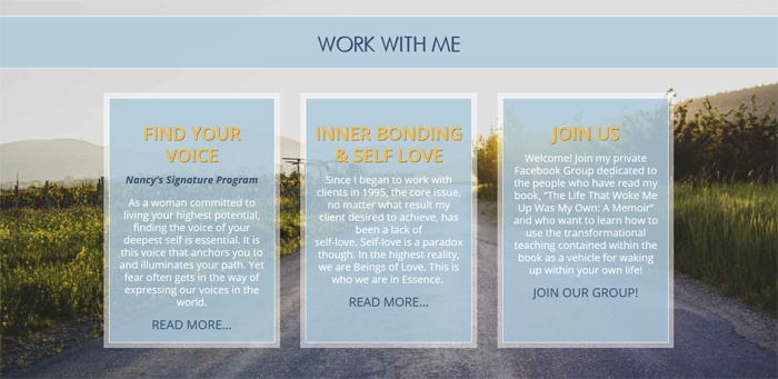
I reorganized the content on her website and Nancy rewrote her copy – in order to be very clear about who she works with and how she helps them with her various programs. I added a “Work with Me” area on her home page that highlights her programs.
I also created a new “Work With Me” web page and added that link to her top menu bar. And I created new web pages for each of her programs, so potential clients can choose to read more details about the program they are interested in.
Goal: Calls to Action and Opt-in Offers
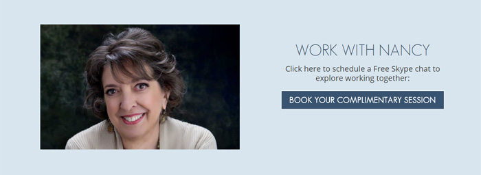
Since Nancy has multiple opt-in offers, plus she has workshops and programs that people can sign up for — we needed multiple CTAs (calls to action) throughout her website. Each of the main pages of her website has at least one CTA section, guiding her website visitors to take the next step in their journey with Nancy! Here are some examples of the CTAs and Opt-in Offers I designed on her website:
Because these offers were repeated in several places throughout her website, I created them as sections of her website that she can easily add to other web pages with a click of a button and she can easily edit the section in one place and it takes effect throughout her website wherever it is used. So if she wants to change the text, an image or even the offer itself, she does it in one spot. Easy peasy!
Here’s a look at how the final website turned out:
Social Media Graphics
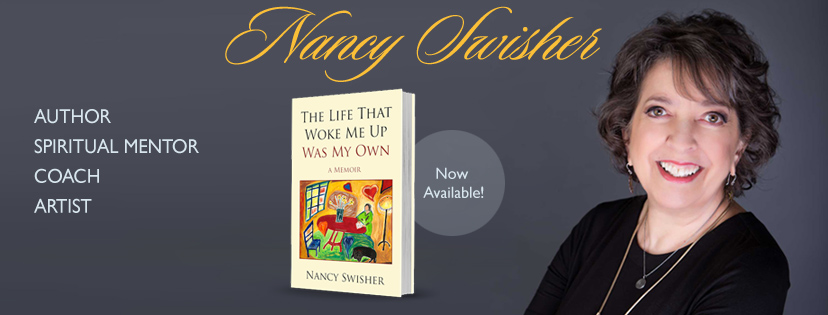
In addition to designing her website, I also designed several graphics for Nancy’s Facebook Page and Facebook Group:
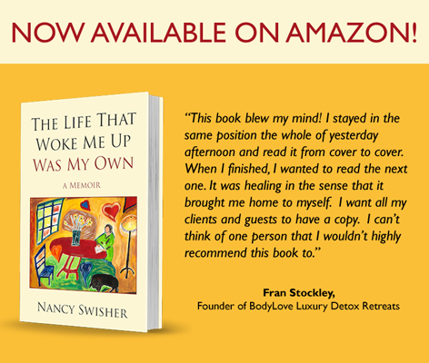
I also designed some images for her to use as Facebook Posts:
Notes from Kelly:
This was easily one of my favorite projects I’ve worked on. Nancy was a dream client and a breath of fresh air to work with. I really enjoyed working with her on her new website as well as creating the additional graphics she needed. She was organized, prompt with responding, and a truly positive and uplifting person. If you haven’t checked out her new website yet, make sure you visit Nancy’s website and get inspired by her writing.
What my Client Says:
“I’ve worked with three other web persons in the last eight years before working with Kelly. All I can say is she shattered all of my preconceived notions of how hard it can be for a right-brained coach like me to co-create with a tech/designer person. Kelly is amazing in that she is so smart, so present and actually cares all at once! Did I mention how fast she is? So if you want a very positive, productive and fulfilling experience with a web designer, she’s the one.“

